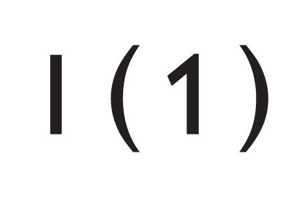
Gill Sans (Eric Gill, Monotype 1928) is an absolute classic,
we designers love it, don’t we?
We do. That is, until we need to use the number one…
Well, it looks like a lowercase l or a capital I doesn’t it. Fine if you’re just using it in telephone numbers, we know people can work that ‘one’ out. But what about in the address, in tables, on signs and stuff; when the numbers and the letters are mixed? It can be very frustrating and not in the least bit confusing.
Here at Creative First, when designing using Gill Sans we often substitute the number 1 with another version from a different Sans Serif typeface. One that’s been designed with a ‘flag’. But it isn’t ideal… The weight can be an issue. The size never matches the height of the Gill Sans letters, so all sorts of fiddling needs to go on. Plus, don’t forget, the kerning needs careful consideration too. Then of course, you have to cut and paste them all over the place!!
Well thankfully you can now get a ‘flagged’ number one as part of the Gill Sans Pro font. Happy days, just another typeface to buy then. But it is a classic, so worth the investment.
To buy Gill Sans Pro visit www.monotypefonts.com


That’s like sticking a towbar onto a Porsche 356…
Or like converting it to run on unleaded…